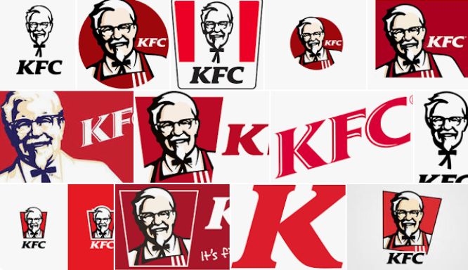
KFC is a dining store that is loved and adored by people all over the world, it is one international store that has franchises in different parts of the world.
One look at the logo is enough to tell you what the brand is and what it is about.
The famous Colonel Harland David Sanders in the logo shows the significance of this man for the business and how positively they have impacted the brand.
To effectively explain your logo and get the right logo for your brand it is important to hire the right logo design agency that can get your logo how you want.
There is always a history behind everything you do; all the big brand logos have some stories behind them.
There is a lot that has happened for them to reach this point.
What you see today, the logo that you see today has not always been like this.
There have been various changes in the KFC logo and the way it has been brought up here. What was the idea behind the logo, how it has been evolved in the last few years, and what was the reason behind this change in the logo?
Let’s explore how your favorite international chain KFC logo has come to this point and how the brand has changed its logo.
Evolution Of The KFC Logo | Design & History
The originality of the Logo
Originally the Lippincott and Margulies created this logo in 1952, however, since then there have been various changes in the logo and has come to the point where it is today.
Since that time, Colonel Sanders’s stylized face who is the founder of this food chain has become one essential part of the overall branding of the organization.
The classic black and white colors were used for the logo and the real name of the restaurant “Kentucky Fried Chicken” was added to the logo.
Later in the year 1978, the main man of the brand got a facelift and the same agency did the work that created the logo. However, the smile of the main man got a bit different and he sported a neater hairstyle. With this famous man’s face, there was the brand name that fits right with it however the typeface was a bit different.
In the year 1991, the whole brand name was then compacted to its initials only and it forever became a part of the logo.
According to a few of the sources, the main reason to go to the initials only was that they wanted to get rid of the word “fried” as it is one unhealthy food choice.
The main color of the logo was added mainly because of its horizontal gradation. Moreover, in the same year, the mansard roofs further got the red strips as well.
Red Logo
This was the time when the designers finally decided to stick to KFC rather than going with the Kentucky Fried Chicken and the logo changed dramatically.
Later in the year 1991, color became the visual identity of the brand.
Now the famous portrait of the Colonel now appears in a blue and white combination which makes them look both friendly and alive.
The bold redwood mark letter is further accompanied by the red rectangular on the top of it. This logo of KFC is both remarkable and bright which reflects the energetic and powerful brand which is KFC, and we all know how big ambitions and plans there are for this brand.
1997 Logo
It is impossible to satisfy the brand managers and the directors therefore there were some more changes required and the whole logo was redesigned by the Landon Associates agency.
The logo in 1997 consisted of the square emblem which features a combination of both red and white background with the portrait of Colonel and wordmark KFC in red, spotted on his tuxedo.
After receiving the logo, the brand managers made some quick changes in the exterior and interior of the restaurant and the whole mansard roof was then later replaced by a flat one while the whole tower grew thicker.
2018 and Today
Even between the years 1997 and 2018, there had been various minor changes in the logo and its branding but in 2018 the whole shape of the logo was changed to trapeze and they refined the portrait as well. The red and white background of the brand included three vertical lines. The face of Colonel was then contoured black and is placed on the white line with the italicized KFC wordmark underneath it.
Final Thoughts
There is no denying the fact that the logo of KFC is both welcoming and bright and is a perfect go-to place for everyone looking to have a fine dining experience with exquisite taste and quality. One can have a sense of warmth and hospitality once they enter the restaurant.

Amanda Jerelyn
Digital Marketer/Tech-Geek
A Digital Marketer and a Tech-Geek, she loves to write about business, marketing, technology and SEO. If you’re looking for an agency to design your logo, Amanda suggests Ingenius Guru. Amanda is featured at Rebrandly and currently looking for other blogs to contribute.
You can contact her at amandaj@guide2write.com.


0 Comments